
Trasformare i dati di ricerca in storie visive che guidano le decisioni aziendali.
Autore: Jaikishan Verma, Senior Research Analyst
28 maggio 2026
APRILE 2026

Dai numeri alle narrazioni: Trasforma i dati in storie visive
Nello scenario odierno, la sola disponibilità dei dati non è sufficiente, poiché anche il modo in cui vengono presentati gli insight gioca un ruolo fondamentale nell'aiutare aziende, investitori, ecc., a comprendere facilmente risultati complessi.
Compiti complessi, come i risultati dei dati, la conversione dei dati e la loro definizione in grafici e immagini, vengono eseguiti con l'assistenza di strumenti di IA. Questi strumenti migliorano la qualità della presentazione, fanno risparmiare tempo e rendono i risultati della ricerca più coinvolgenti. Tuttavia, la competenza umana rimane essenziale per garantire accuratezza, contesto e narrazione significativa in linea con la ricerca.
1. Infogram / Visme: Infografiche interattive e dashboard
Cosa fanno:
Questi strumenti aiutano a convertire i risultati della ricerca in infografiche, report e dashboard visivamente accattivanti e illustrativi. Che si tratti di presentare tendenze di mercato, risultati di sondaggi o di rappresentare statistiche chiave in un formato chiaro e professionale, questi strumenti svolgono essenzialmente un ruolo cruciale nell'aiutare la ricerca.

2. Tableau Pulse / Power BI AI Visuals: Visualizzazione dei dati più intelligente
Cosa fanno:
Utilizzando la tecnologia IA, queste piattaforme forniscono raccomandazioni appropriate su quali grafici utilizzare, riconoscono i modelli ed estraggono informazioni chiave dai set di dati. Questi strumenti aiutano nella creazione di dashboard in meno tempo con maggiore chiarezza, senza compromettere l'accuratezza e la rilevanza per il business.

3. Midjourney / DALL·E / Leonardo.ai: Immagini concettuali e copertine per report
Cosa fanno:
Queste tecnologie generano immagini, immagini tematiche e copertine per report basati sui testi forniti. Saranno utili per migliorare l'aspetto visivo dei lavori di ricerca, soprattutto nei casi in cui la presentazione verrà utilizzata per report di settore e altri scopi di marketing.

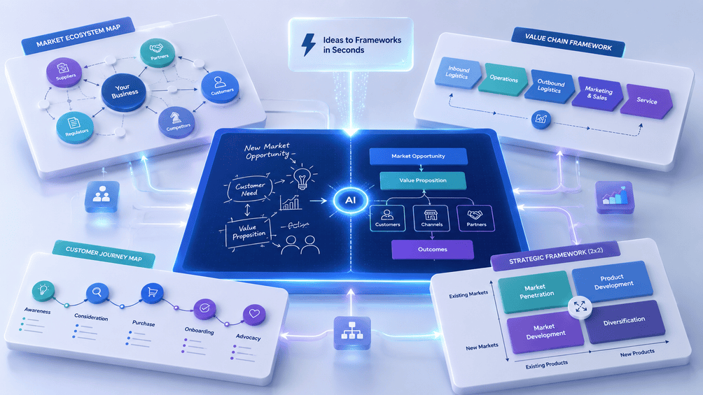
4. Napkin.ai / Vizzlo – Visualizza framework e modelli in pochi secondi
Cosa fanno:
Questi strumenti sono favorevoli alla creazione di diagrammi a partire da idee, processi e modelli di business. In sostanza, l'ecosistema di mercato, la catena del valore, il customer journey e i modelli strategici possono essere spiegati attraverso questi diagrammi.
Un nuovo standard per la narrazione
Gli strumenti per la visualizzazione che utilizzano le tecnologie di IA stanno rivoluzionando il processo di comunicazione nella ricerca scientifica, facilitando la facile generazione di visualizzazioni come grafici, dashboard, infografiche e diagrammi concettuali.
Il più grande vantaggio di questi strumenti è la semplificazione di set complicati di dati e risultati di studi di ricerca in immagini, che sono facili da capire.
L'intelligenza umana è ciò che rende possibile visualizzare le conclusioni basate sui dati attraverso la tecnologia IA.
Rimani connesso
Seguici per aggiornamenti in tempo reale sulle ultime tendenze basate sull'IA.
Sito web: UnivDatos
LinkedIn: UnivDatos LinkedIn
Twitter: @UnivDatos
📩 Per domande, contattaci a contact@univdatos.com
Prossimi eventi e webinar
Richiedi richiamata
Notizie correlate
Iscriviti alle nostre newsletter
Inviando questo modulo, comprendo che i miei dati saranno elaborati da Univdatos come indicato sopra e descritto nella Politica sulla Privacy. *